About a year ago, at the previous MLA, I gave a talk on a panel that detailed literary reactions to the Scottish Rising of 1745. I’d thought I’d written about it, but in the process of getting this server back up and running, I found this old draft post. As part of that panel, I gave a talk on Victorian reactions to the ’45, focusing on the novels of Margaret Oliphant and Robert Louis Stevenson. Part of the question I wanted to raise was whether the rising is typically understood at a site of political and historical closure that cements the constitution of “Britain” as a cultural entity. One way to get at this, I thought, was to see whether literature written about the rising emphasized Britain over Scotland and England.
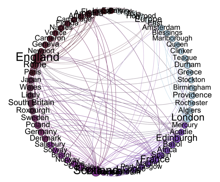
But it was also a good opportunity to experiment with using network analysis and mapping to explore the geographic imagination of the nineteenth-century novel. One way to raise the question of political formation i to look at the locations that are explicitly cited in each novel, and to map out how they are connected. To do this I extracted location entities from several of Stevenson’s novels using the Meandre framework (apparently now defunct), as well as 65 of Oliphant’s, derived from the Internet Archive, and I did a series of network analysis graphs using Gephi to look at which locations are cited most frequently, and which other locations they tend to be cited with. An example of a plot this produced is below, and shows locations referenced in Oliphant’s novels, sized by reference frequency and connected by proximity of references.
I found it hard to figure out how to visualize the networks effectively in a talk. This was less of a problem for the Gephi visualizations, which are static, though images with a large number of nodes presented a challenge. One strategy I experimented with was to do a screen capture movie and then edit the movie so that I could produce a video that zoomed in as I spoke. In retrospect, it would have been more effective and flexible to use Prezi.
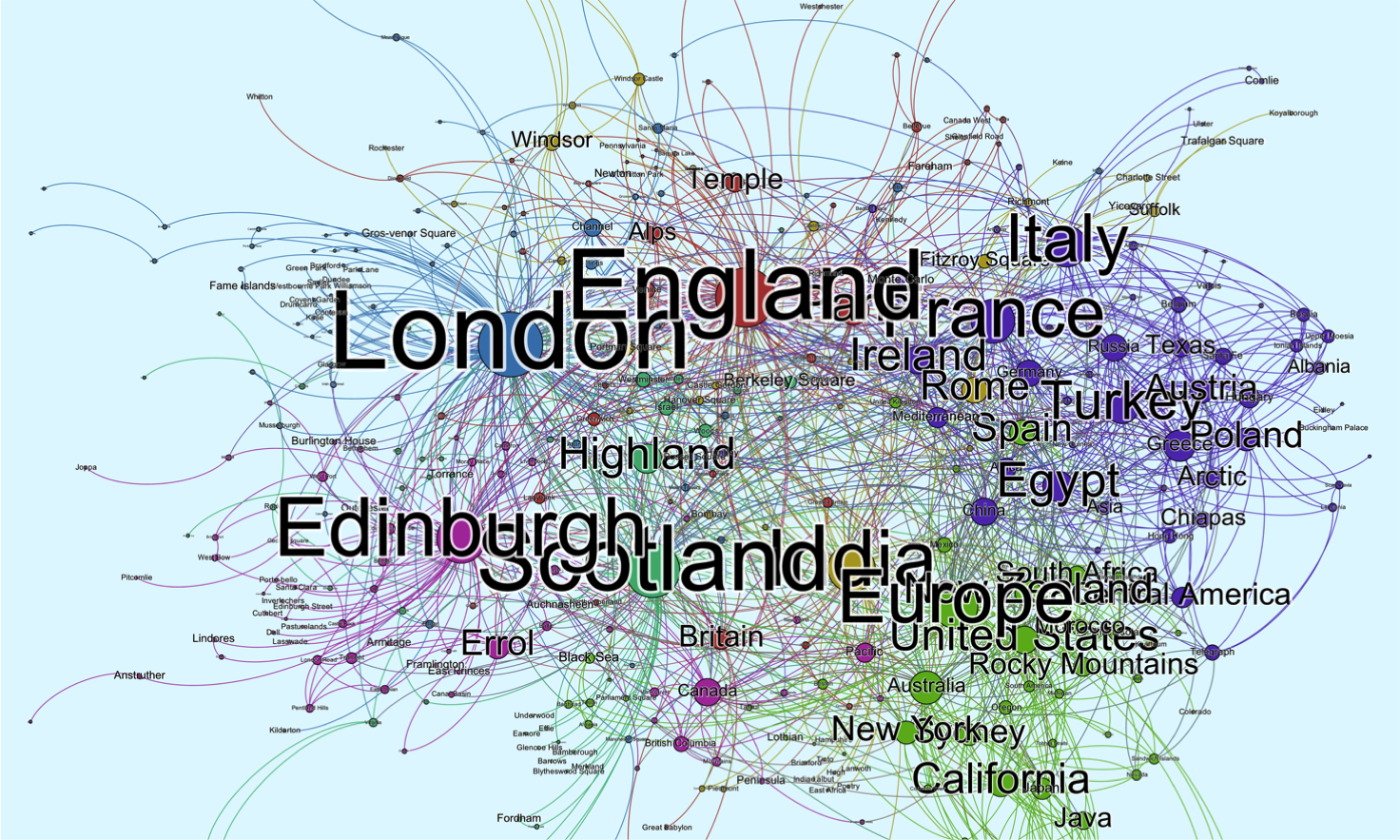
One question that working on the talk raised was how to evaluate the utility of these visualizations in the context of a talk. In the case of Oliphant, the justification accrues in the difficulty of assessing the range and depth of her fiction. An essayist and author of more than ninety novels, works which were often simultaneously serialized across several publications, it is almost impossible to wrap your head around her production. On the other hand, it’s a gives you the chance to make some nice visualizations. Here’s two animations I made using GEPHI and Google Maps. The first is a network map of locations in her novels with node size and proximity scaled to total number of links, the second is a world map with the locations geocoded.