I’m still working on slides for my talk at the MLA on Stevenson and Oliphant, and Victorian reflections on the ’45 (force-directed network and Google map visualizations here and here). I’m also starting to experiment with Gephi, a powerful open source graph editor. I was blown away by Matthew Jocker’s “Nineteenth-Century Literary Genome” animation, and wanted to know how it was made. Apparently, they produced it one frame at a time as separate png files and then assembled them using Quicktime.
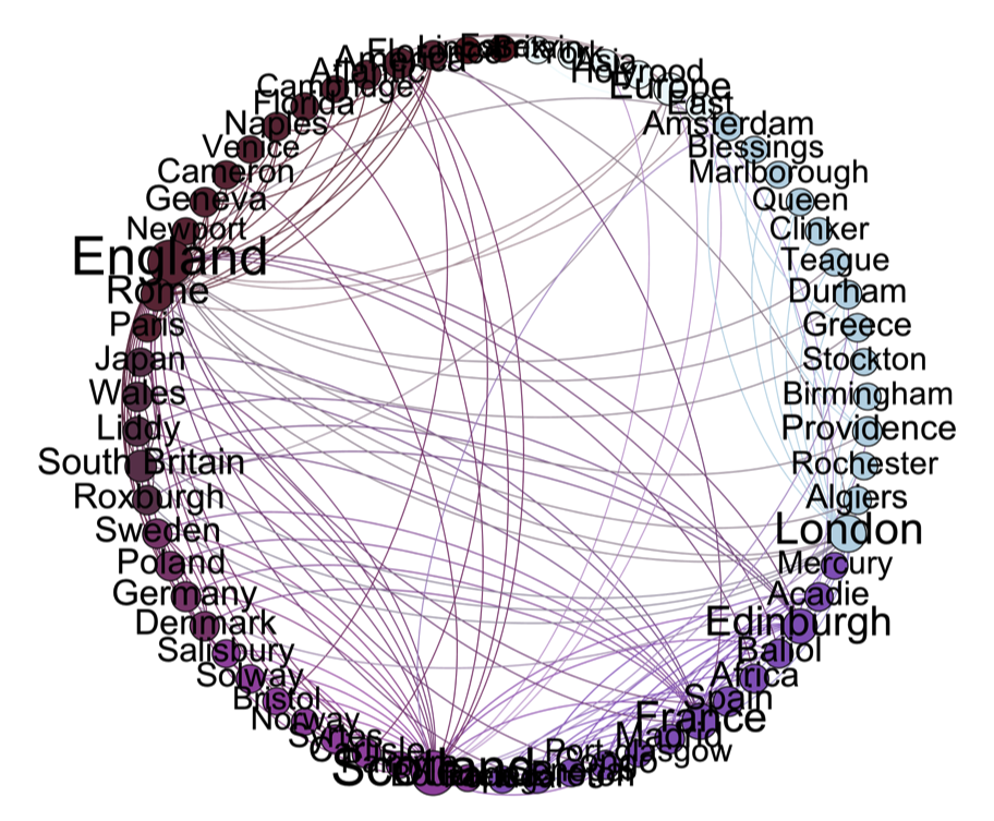
I’m still trying to figure out how to produce animations, but I like working in Gephi. It has a feature-rich interface and allows you to edit and remove nodes, perform clustering and various forms of network analysis easily and produces sharp images. Here is the location entity network from Humphry Clinker (1771), arranged into eight clusters, with nodes and edges colored by group:
Gephi makes beautiful static images, and as can be seen in genome video, beautiful animations. On the other hand, unlike the Protovis graphs, finished visualizations are not dynamic or interactive. You can’t output a script-based visualization that the user can play with, or that could be embedded in a presentation. Not a problem for a presentation, really, but I like the activity that a Protovis graph can bring to web publishing.
I’m also evaluating these various visualization approaches in order to prepare for my historical fiction and fantasy seminar next semester, which will ask the students to help produce an online textual exhibit using Omeka. I’m going to ask them to look at what’s possible and then pitch paratextual visualizations & tools to package with the exhibit.